Ads 4.68x6.0px

Labels

Thursday, August 7, 2014

The Lone Ranger: the best VFX you never noticed?

Monday, August 19th, 2013 | Posted by Jim Thacker
130812_TLR_desert

Forget the plot: the backdrops in The Lone Ranger are literally out of this world. VFX supervisor Tim Alexander and digital matte supervisor Dan Wheaton of ILM tell us how the movie’s largely full-CG environments were created.

The Lone Ranger may have taken something of a mauling, both at the box office and at the hands of the critics, but there’s more to director Gore Verbinski’s take on the classic Western serial than meets the eye.
In fact, the best part of the movie may be the one that most critics never noticed – or rather, never noticed had been created by human hands. Industrial Light & Magic contributed 375 visual effects shots to The Lone Ranger, almost all of them invisible, including photorealistic trains and environments.
In this article, VFX supervisor Tim Alexander and digital matte supervisor Dan Wheaton tell us how some of those effects were created, discussing how the facility’s decision to move to a 3ds Max/V-Ray pipeline enabled it to create supremely photorealistic results – and to do so not for a single environment, but for hundreds.

130812_TLR_breakdown1

130812_TLR_vista

130812_TLR_breakdown2

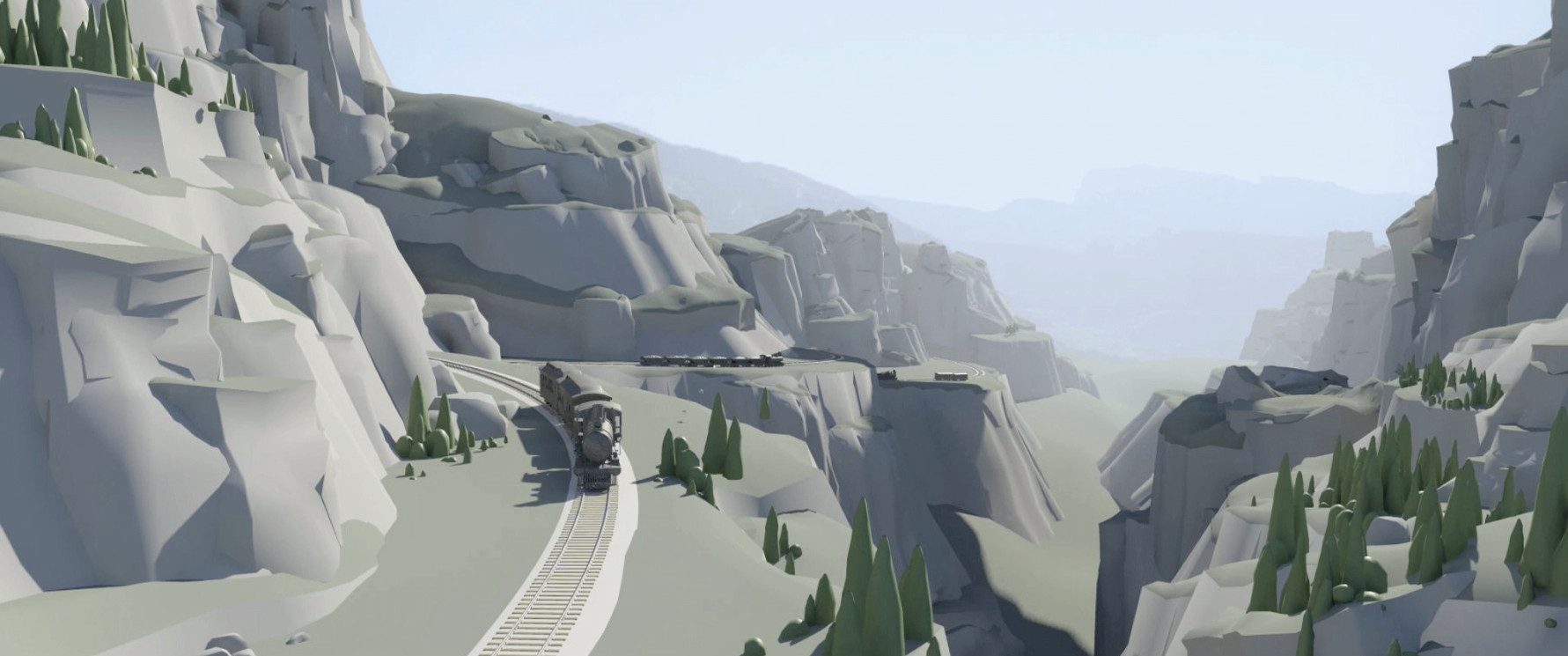
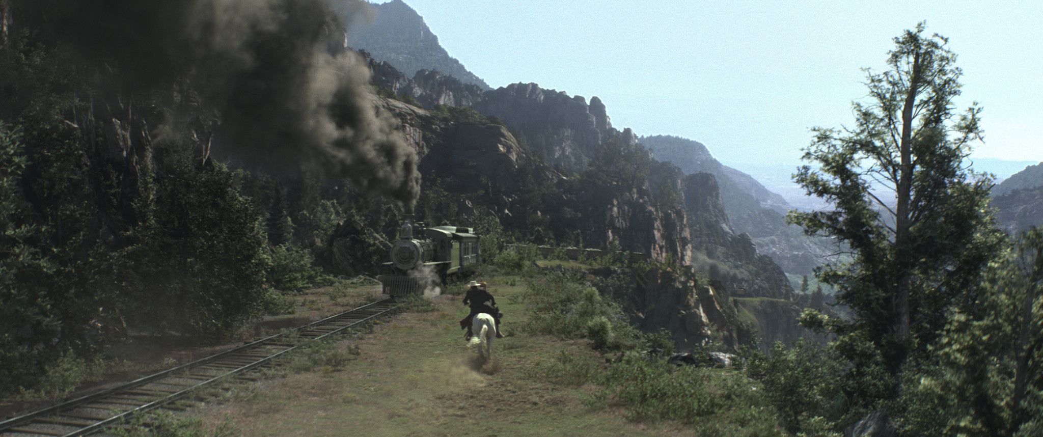
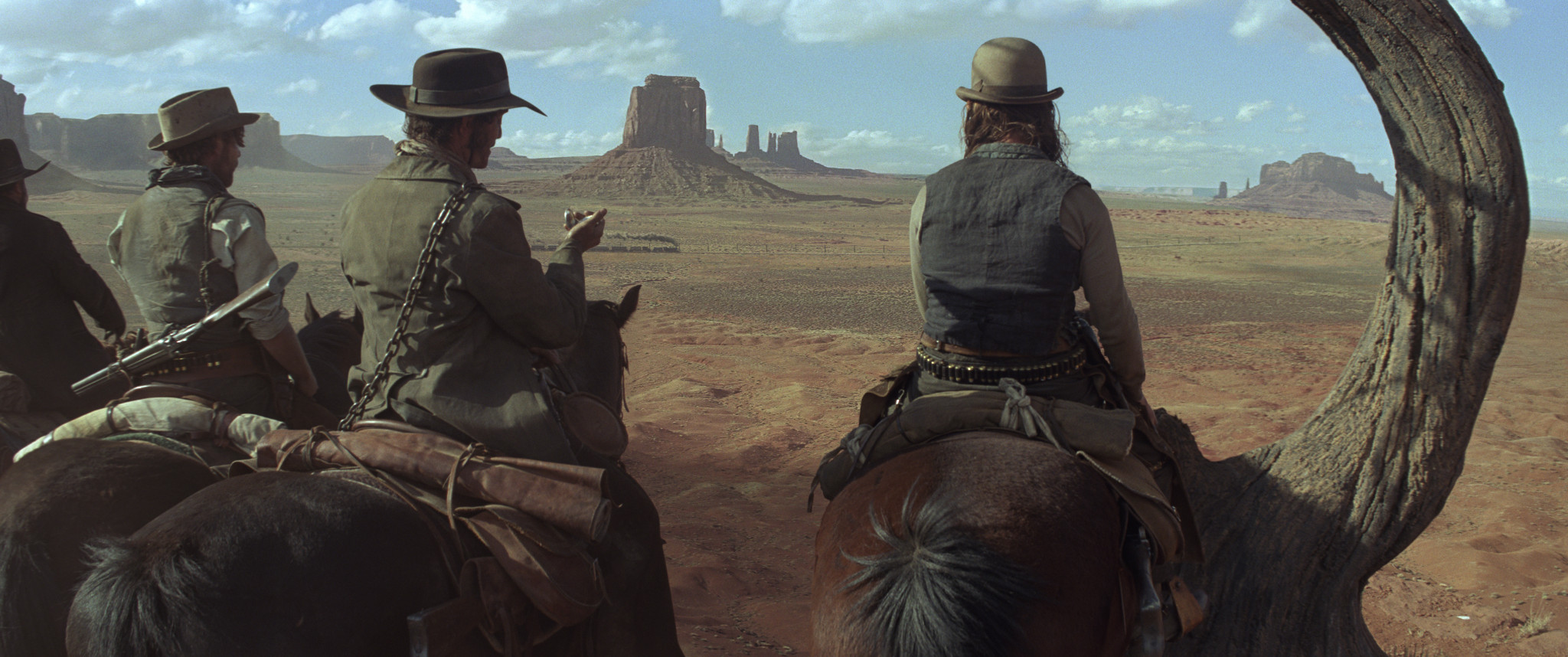
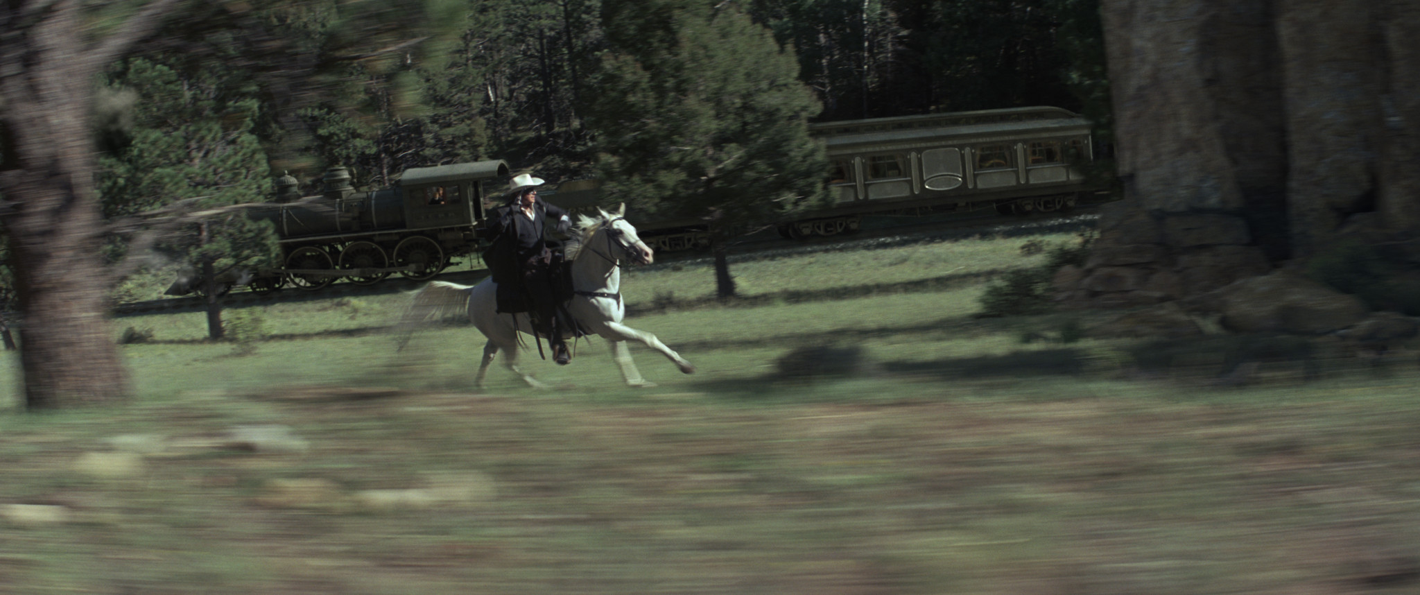
The third act of the movie is a choreographed chase between two trains. ILM worked to director Gore Verbinski’s animatic (top), trying to make CG environments (lowest image) match the pre-viz as closely as possible.

Scouting the locations
Tim Alexander: The third act of the movie is a choreographed train chase, and every single shot, from Gore’s point of view, is intentional. He did previz very early on that we used all the way through production. It was all about timing and music; there isn’t a lot of dialogue.
Scouting for locations that matched the previz took four to six months, then we were out on location for about eight months. We travelled all over the four corners of the States, looking at pretty much every single train track out there. In the end, we shot in New Mexico, Utah, Arizona, Colorado and California.
Our goal was to try to get at least half the frame in camera, knowing that we’d have to put in the other train in CG. We called it our ‘fifty per cent rule’. But when we started shooting, we realised we weren’t going to get as much as we’d hoped. There was the difficulty of shooting actors on top of moving trains and getting good performances out of them. And the production schedule dictated that we had to move back to LA and shoot some stuff bluescreen we hadn’t necessarily wanted to.
When that started happening, we very quickly started capturing reference material. We covered every location in every way possible: LIDAR scanning, tons of spheres, and we drove down the road with either a VistaVision or an ARRI studio camera to shoot plates we could potentially tile.
I thought we might be able to compile some of the plates and use them as backgrounds, but when we took them into post, it was pretty obvious that they weren’t going to work. For one, Gore wanted the lighting to match exactly between the foreground and the background, so we weren’t giving anything away: he didn’t want that bluescreen look. And having to have both trains at very specific points in frame meant that we had to modify the topology quite a bit just to tell the story. Even if we could get a background plate, we’d have to have modified it anyway.

130812_TLR_wreckedtrain

Despite a shoot that crossed five states, the difficulty of finding real locations that matched the action required ILM to create hundreds of individual CG environments, working on a largely per-shot basis.

Building environments entirely in CG
Dan Wheaton: When you build an environment for a show, then drop fifty or a hundred cameras into it and get all your shots out, you’re leveraging a ton of work in a single unified set. What we had here was a moving environment. We were changing from shot to shot on the fly. We couldn’t build a single set; we had to build a set per shot and still maintain that level of finesse and believability, as we moved from foothills through into mountains.
The challenge was two-pronged. We had not only to do invisible work – we all know what forests and hills look like, so there’s no room for suspension of disbelief – but do so on three to four hundred shots where you’re constantly on the move. The original environments were a starting point. But Gore’s mandate to me and our team was to take people on a real ride: to make things believable, but bigger, bolder; as dramatic as we could get.
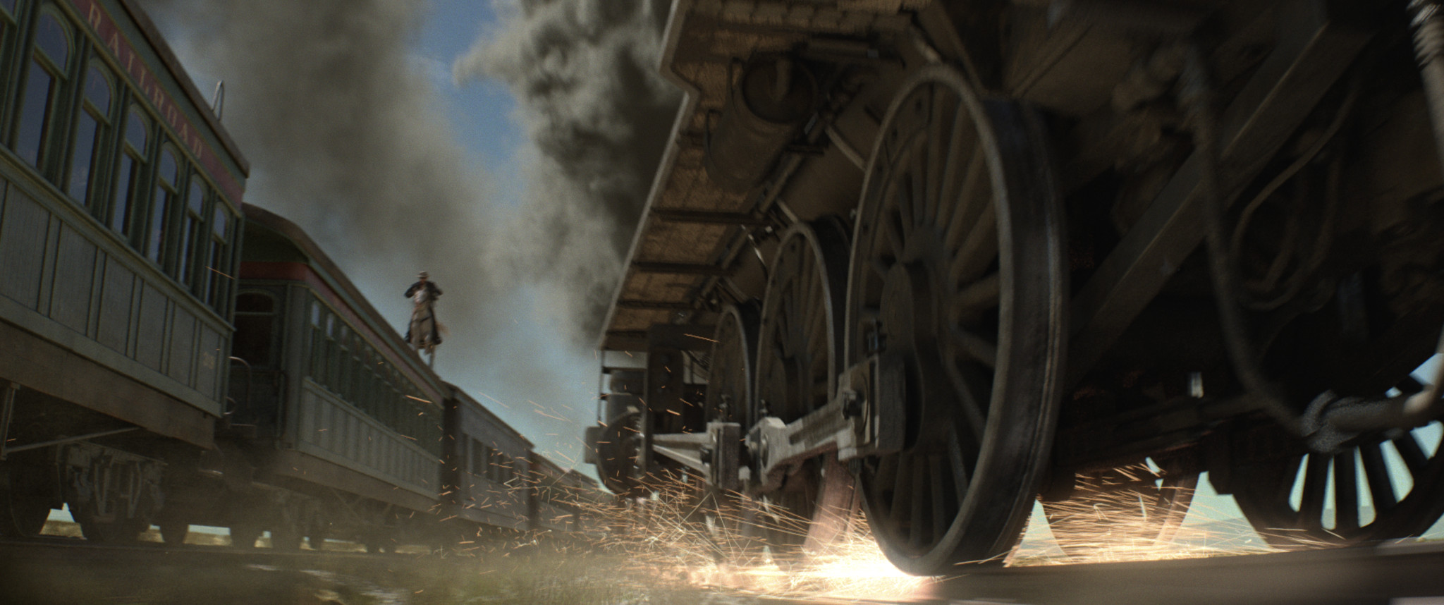
TA: There was a lot of regular old camera stuff. If you look out of the side window of a moving car, it feels fast; if you look out of the front, it feels quite a bit slower. It’s exacerbated by longer lenses: if you have a long lens and you’re shooting forwards, it doesn’t feel like you’re moving at all.
For the third act, which is all about excitement and speed, that was quite an interesting problem. Gore wanted everything to be going fast, so Dan and his team would have to move things in so close to the train that in reality they would be physically hitting it in order to get things whip by the camera. We also had trains going 60mph, whereas at the time, they were only going at 15mph.

130812_TLR_chase

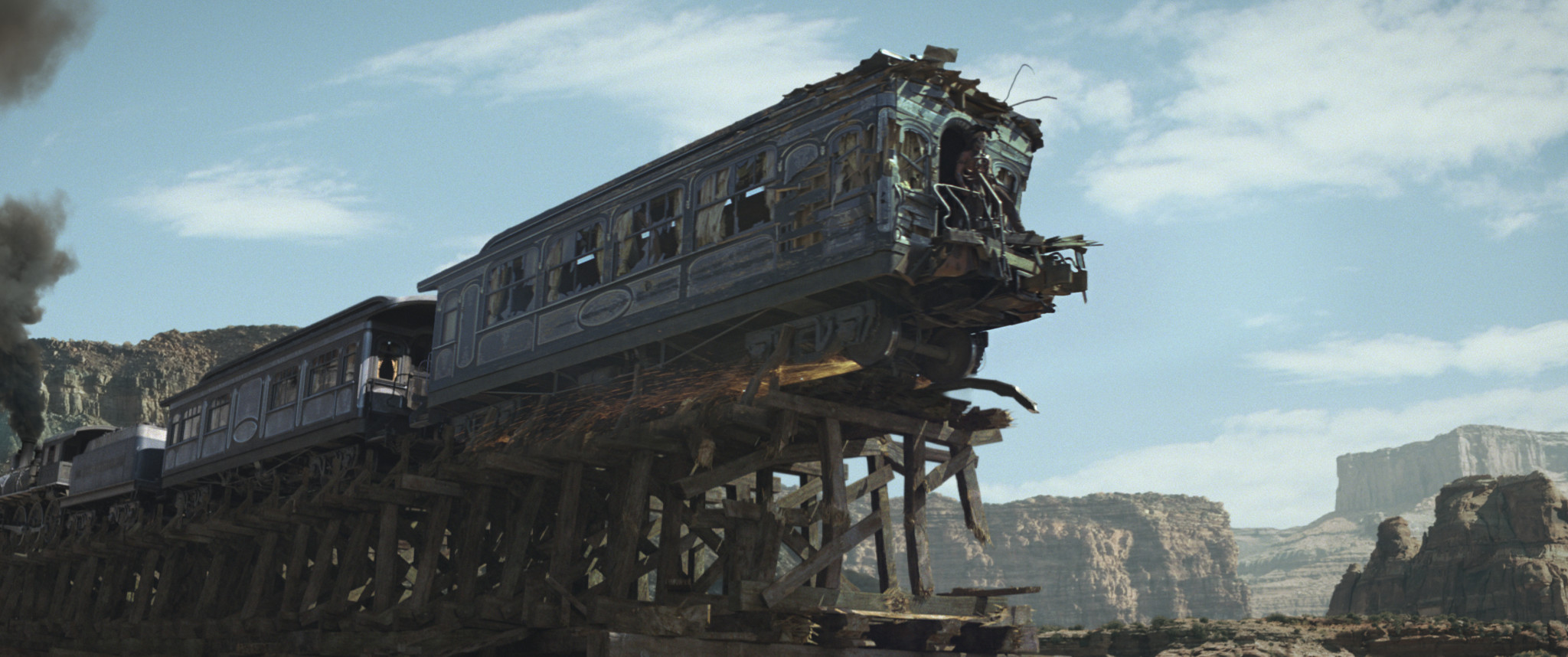
Although based on live background plates, Gore Verbinski directed ILM to make its digital environments “bigger and bolder” than reality, heightening the chase sequences’ sense of speed and drama.

Choosing the pipeline
DW: We leveraged what we had learned on Rango, and before that, on Avatar. The environment work on Rango was really focused on desert, so we developed a pipeline that could handle that. But while Rango was photographic, as far as the level of detail went, it wasn’t photoreal. This time, we needed to get photoreal CG environments.
When we started The Lone Ranger, we changed some of the toolsets under the hood: we went strictly over to 3ds Max, using V-Ray as our renderer. That was the final piece of the puzzle. We were getting not only great render results, but great render throughput: it could handle everything we were throwing at it.
Building the assets
DW: There was never any huge asset-building phase. We started with a very simple layout and worked from there, initially creating rock geometry for very specific uses, then repurposing it, just by dressing sets differently. We kept things fluid and light.
We did most of the asset build in 3ds Max, but it could be in ZBrush [or other packages] if we needed it; there were a variety of approaches.
The texturing is a mix of photographic work and hand painting. There are certain shots that are more matte painter-ish and you need a matte painter’s eye to pull everything together, but we had terrific photo reference, and that keeps you honest.

130812_TLR_trees

Vegetation was created almost entirely in SpeedTree. IDV’s vegetation-generation tool enabled ILM to generate variant trees quickly and efficiently, and add subtle animations to bring the environment to life.

Creating vegetation
DW: For the vegetation, SpeedTree was pretty much the only solution we used. It’s a really artist-friendly tool when you’re trying to create something organic. You can get a lot of variety very quickly, just by putting in different seed values. But you can also go in and hand-draw splines and get a match to a tree you want to replicate. It does everything from quick solutions right down to full control.
TA: The other important thing was to have the trees move. That’s always been an issue with big environments. It’s fairly easy to populate an environment, but having all the trees move – and move in an interesting way – is tough.
Again, we were able to get that out of SpeedTree. We didn’t move every single tree, just ten or fifteen that were at the right spot in the frame. Even adding one tree at the right spot in a frame made a huge difference. We didn’t have to move every tree to make the environment feel alive, but we did have to move the right one.
Dressing the sets
DW: The total number of assets that make up the environments is smaller than you would think. We had the most variety in the trees: by the end, we had several hundred models, and animated versions as well. But we only had fifty or sixty rocks and mountains and cliffs. There would be one-offs where we had to model something very specific to match into a plate, but otherwise we were able to reuse our assets very efficiently.
We used in-house 3ds Max scattering tools to populate the environment very quickly. That allowed us to take the trees, put thousands of them into a set and randomise them. You can control the types of trees in an area, and their scale, rotation and density, with a spline or a map.
That was something we leveraged from Rango. Here, we simplified the process and just did a blocking take very quickly: there was no worrying about shaders, we populated a set with a lot of our tree assets, created forests and indicated hills, and ran the camera through it very quickly. In no time, we had a rough take we could use for a large group of shots, and that gave Gore something to feed back on.
Seventy-five to eighty per cent of the environments [from our work on the third act of the movie] were full 3D. We’d built trees at different resolutions from hero-res right on down to a proxy level, and we were thinking, ‘Okay, we’ll put low-res trees off in the distance, then hi-res trees in the foreground, and we’ll be more efficient that way.’ But V-Ray was just such a solid render choice, we used our hero trees all the time. We put ten thousand hero trees out there and we got a look that was great, that rendered quickly, and that kept us flexible: we didn’t have to worry about using cards.
Lighting and rendering
DW: The lighting was really simple. We were always looking to do three-quarter backlit because it’s a setup Gore really likes and he tends to shoot a lot that way, but it was driven by the plates. We used a V-Ray Sun and GI, aiming for a very naturalistic look and feel.
TA: It came down to questions like, ‘Do we use scatter on the leaves? How much specular do we use?’ – all those little details. When you look at a real environment, there’s so much difference between individual trees, and getting that fine detail into our renders was a major challenge.
But from my point of view as the supervisor, the biggest challenge was making the environments look cohesive. With a bluescreen shoot, you might start at 9am and end up at 5pm. You try to cluster shots by sequence, but even then, the sun is drifting, and Gore has a tremendous eye for cinematography. To him a bad lighting direction on a background plate screams ‘bluescreen!’.
It was a matter of moving the lighting direction to match the foreground, and with this methodology we could do that. Traditionally, it’s very difficult to relight from shot to shot: you want to set up one lighting rig and render a bunch of shots with it.
Integrating foreground and background
DW: The more you invest in 3D in the environments, the more you benefit in the integration in the final shots. V-Ray and Max gave us a lot of control. You get a lot of things for free in the render, and then you can break it down to a very granular level for control with the AOVs. And when you’re doing full CG, you can get deep renders, which allows the compositor to get a full 3D representation in the compositing package.
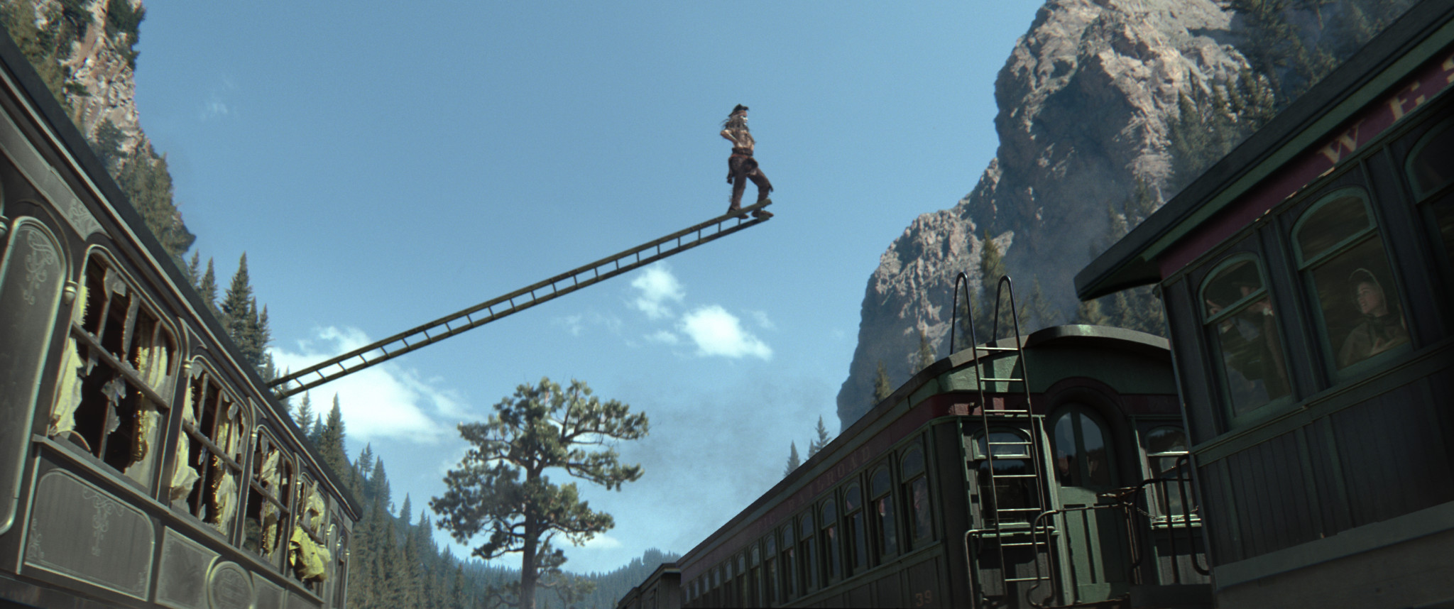
There weren’t any explosions destroying environments, but we did have shots like the one in the trailer of Johnny [Depp]’s character jumping from a ladder onto a train and the ladder getting smashed against a tree. We also had smoke going through shots the whole time.
TA: We had about 150 people on the show, and at one point we had almost 20 FX people just doing smoke!

130812_TLR_stunt

Despite a few more obvious stunt sequences, the majority of ILM’s effects in the movie are invisible. Dan Wheaton describes the level of quality and consistency the studio achieved as the ‘Holy Grail’ of environment work.

A new benchmark for invisible effects?
TA: Overall, The Lone Ranger was a really fun movie to work on. I’d never worked on a VFX project that wasn’t about robots, or explosions, before.
DW: The work I’m most proud of is probably going to be the work that people never recognise, and that’s because it’s invisible. I had people stopping me in the hall to say that they didn’t realise that the environments were CG until they happened to see the plates.
It was that Holy Grail of creating believable, natural environments – and maintaining that high level over a lot of shots. There are sequences where the movie goes from plate to CG to another plate for 30 shots, and you’d never register it. But you’re seeing our work throughout the entire third act of the movie. Once the William Tell overture kicks in, you’re in our world.

The Lone Ranger is out now on worldwide release. A further 425 effects shots on the movie were created by MPC and around 200 more by an in-house team. All images in this article are courtesy of Walt Disney Pictures.

Tuesday, August 5, 2014

7 things we learned from creating Flight in the cloud


Atomic Fiction’s VFX breakdown reel for Flight. In the first of our reports from FMX 2013, we explore the studio’s cloud-based rendering pipeline – and co-founder Ryan Tudhope’s advice to facilities following in its footsteps.

Its budget may have been a fraction of that of Life of Pi, but Flight still set a milestone in visual effects. Paramount’s 2012 plane-crash drama was the first movie from a major studio – and, in the shape of Robert Zemeckis, a major Hollywood director – to be rendered entirely in the cloud.
The movie’s 400 VFX shots were created by a single facility: Emeryville’s Atomic Fiction. Although founded only two years earlier and lacking the infrastructure of its established rivals, Atomic Fiction was able to take on the job thanks to its partnership with ZYNC: a cloud rendering platform that promises ‘Goliath power for the Davids’. Its on-demand render service, which is based on Amazon’s S3 cloud, scales up to “an ILM-sized farm in minutes, then back down to the iMac on your desk”.
In his presentation from the Cloud Computing track at this year’s FMX conference, Atomic Fiction co-founder Ryan Tudhope ran through the lessons the studio learned from working on Flight, and provided his tips for other studios considering working in the cloud.

1. Choose a local provider
VFX may be a global business, but think locally when choosing a cloud services provider. Minimising the distance of the artist from the data on which they are working is critical if a pipeline is to remain responsive.
“The data center location is particularly important,” said Tudhope. “For us in the States, Amazon has a west coast and an east coast data center, and there are different configurations of machines in each one. [Being based in the Bay Area] we obviously use the west coast one because it’s a lot faster to get stuff in and out of.”
For larger companies, the problem becomes one of finding a provider that can provide data centers local to all of their individual studios. “Being able to spin up instances in any part of the world is critical,” said Todd Prives, VP of business development at ZYNC. “We have customers in Asia, in Singapore, in Western Europe, in Australia [but since ZYNC uses the Amazon cloud] we have the ability to build duplicates of our original US farms anywhere in the world. That’s critical as we see a more globally distributed workforce.”
2. Check your connection speed
“Obviously, connection speed is extremely important to get all of that data back and forth,” added Tudhope. While ‘private cloud’ systems like those of the Vancouver Studio Group – set up to pool resources between facilities including Rainmaker Entertainment, Image Engine and Digital Domain – use dark fibre connections, a 1-10GB connection should suffice for studios working at a greater distance from their data center.
3. Preparation is crucial
Bringing plates and other assets online is a time-consuming task – and therefore one that becomes all the more significant when working remotely. Atomic Fiction ‘pre-heats’ static data at the start of each job. “When all the plates come in at the beginning of a show, we immediately convert them to EXRs and upload them to the cloud,” said Tudhope. “When [artists] come to render or do comps, those frames are waiting for them.”


A video overview of ZYNC’s cloud-based render service. Still in beta while Atomic Fiction was using it to render Flight, the service has since launched commercially, and has now been used on 12 feature films.

4. Minimise ‘stale’ data…
While the cost of renting server space may be less than that of powering, cooling and maintaining local servers, that’s no reason to incur unnecessary charges. “As you’re paying for S3 storage, having 15TB of data up there you don’t need is obviously a problem,” said Tudhope.
In order to minimise this ‘stale data’, it helps to adopt a more games-like mindset. Be rigorous in eliminating unnecessary geometry from your scenes, and be wary of uploading textures at a higher resolution than they will be seen, ‘just in case’ you need the extra detail later. “In the new world order that is the cloud, there are all these [new] things you have to learn and start doing,” said Tudhope.
Tudhope noted that the fact that Atomic Fiction has used the cloud from day one helped its staff adopt this new mindset: “The artists realise we’re paying for rendering … so they work hard to optimise their scenes,” he said.
5. …but don’t take things down too quickly
However, don’t be tempted to delete files too quickly. “When you create large data sets in the cloud, keep them there,” said Tudhope. “[When you generate] a really expensive big render [you can] literally leave it on S3 so when your comp goes to pull that element, it’s already up there: you don’t need to upload it and download it.”
6. Don’t put all your eggs in one basket
While cloud rendering may have been critical to its work on Flight, Atomic Fiction hasn’t entirely abandoned the idea of building its own infrastructure: something Tudhope described as providing a ‘waterline’ for future work.
“Over the course of a show there are peaks and valleys [in processor usage] – there are test screenings, deadlines here and there, and the final push at the end of the project,” he said. “What we want to do is create a local infrastructure that fills in those [valleys] and makes [the peaks] look more like islands. That way you’re not completely reliant on the cloud if it should go down: you have a small local farm that can handle things.”
7. Maintain consistency of file paths
Finally, consistency is critical. “We have to maintain parity between our cloud location and our local location,” said Tudhope. “The paths to our Amazon storage and our local storage are identical.”

Visit Atomic Fiction online
Visit ZYNC online

Monday, August 4, 2014

Mi-24 Overview


VFX for TV Series

By: Christine Bunish

Iconic characters, both fictional and historical, and a tale from suspense master Stephen King have come alive on the small screen with help from VFX studios. From creating digital environments, futuristic transports and retro inventions to crafting supernatural beings and otherworldly events, VFX enhance the stories of superheroes, pirates, retail magnates, time travelers, small-town Americans and the world’s most famous vampire.

AGENTS OF S.H.I.E.L.D.

ABC’s new Marvel’s Agents of S.H.I.E.L.D., Marvel’s first venture in live-action television, features the Avengers storyline and characters coupled with extensive VFX by lead vendor FuseFX (www.fusefx.com). With such iconic characters at the core of the series there are frequent references to their incarnations in the comics and on the big screen — ILM has even shared assets created for the films — so consistency is critical. But FuseFX has been able to create and interpret a number of new elements, which make the world of the agents larger-than-life.

The series is shot in Culver City, CA, where show VFX supervisor Mark Kolpack is on-set. FuseFX’s artists work from the company’s Burbank office; their numbers have swelled to deliver the large volume of complex shots, which 22 episodes of Marvel’s Agents of S.H.I.E.L.D. demand. With a highly efficient custom pipeline management system and nearly 60 employees, FuseFX has managed to deliver VFX for the series while continuing VFX work on many other shows and projects, including American Horror Story, Hell on Wheels and Criminal Minds.
 
“We have staffed up and reallocated resources so we have two independent teams working on different episodes of S.H.I.E.L.D. with creative supervision overlapping,” explains FuseFX CEO/VFX supervisor, David Altenau. The company also upgraded to a 300TB Isilon cluster, which doubled its storage capacity, added render nodes to its render farm, and more workstations and software. The chief software tools are Autodesk 3DS Max, Chaos Group’s V-Ray and The Foundry’s Nuke.
One of the signature elements in the show is The Bus, a modified C17 military transport plane outfitted with S.H.I.E.L.D. technology. It acts as the agents’ mobile HQ and can travel anywhere in the world at a moment’s notice. FuseFX contributed significant design input to the plane, building “vertical take off and landing into the design from the pilot, although those capabilities weren’t revealed until Episode 8,” says Altenau.
“A very complex rig controls every aspect of the plane: the landing gear, engine transformation, doors opening, lighting — even the wings have flex controls for the animators to sell the weight of this massive aircraft. When the engines are in vertical flight mode, they have several degrees of rotation, which give the jet a lot of maneuvering ability.”
For Lola, the classic 1962 Corvette that appears on the show, FuseFX added hover capabilities, turning its wheels to a horizontal position and exposing hidden jet-engine ducts. Once again, FuseFX led the collaborative design process with Kolpack and production for Lola’s undercarriage and jet engines. Sometimes the real Corvette is shown transitioning to its hover mode with Sitni Sati’s FumeFx adding volumetric dust and exhaust, and Side Effects’ Houdini particle effects. Sometimes FuseFX is required to use a fully-digital model of the car, which matches the real vehicle precisely.
 
On the human side, FuseFX provides robotic leg replacement for Mike Peterson, or Deathlok, and digital doubles for augmenting stunts and performing fully-digital stunts. In a dramatic one-off stunt sequence, two of the main characters jumped out of the back of The Bus with only a single parachute; the sequence included 30 shots and was a combination of a fully-digital environment, digital doubles for wide shots and actors shot on greenscreen with a gimbal rig.  

In another one-off shot, the team battles one of the key villains, Ian Quinn, who creates a massive machine that harnesses the exotic substance, gravitonium. The episode culminates with Dr. Franklin Hall falling into and getting consumed by the gravitonium — giving FuseFX the opportunity to help visualize the genesis of one of Marvel’s classic characters, Graviton.

One of the keys to doing VFX for TV successfully is “client-VFX chemistry” and constant close communications, Altenau says. “You need to head toward the target as quickly as possible creatively. On features you have the luxury of taking a detour to try something new, but on TV you don’t. Everyone has to be on the same page in terms of creative direction so you can get to the end game on as direct a path as possible. Marvel has been really great at collaboration and working constructively with us to achieve that. We’re very excited to be working on the show. We couldn’t imagine a better series to be involved with.”

DRACULA
Dracula’s back and he’s never looked so good. In the guise of American entrepreneur Alexander Grayson, the iconic vampire, elegantly played by Jonathan Rhys Meyers, is alive (or undead) and well in Victorian London, surrounded by lush locations and beautiful costumes. Little wonder that the woman who appears to be a reincarnation of his long-dead wife falls under his spell.
He can’t escape his blood-soaked past (and present), but NBC’s Dracula draws the line at excessive gore. In fact, its London-based producers, Carnival Films, are the folks behind Downton Abbey. “They bring a Downton aesthetic to the show,” notes the show’s VFX supervisor Kent Johnson, who serves as VFX supervisor/producer at LA’s Stargate Studios (www.stargatestudios.net). “The violence in Dracula is very subtle; they didn’t want it to be in your face.”
 
The challenges for this new interpretation of Dracula concerned inventing his world, says Johnson. “We had to answer a lot of big questions and determine the visual aesthetic.”
He spent six-and-a-half months in pre-pro and production in Budapest, which doubles for Victorian London. He met early on with the producers to discuss some very “high-concept ideas,” including how to visualize the mystic visions of vampire seers and Dracula’s own point of view, which manifests itself when the blood-starved vampire sees people’s pulsing hearts and veins as he walks down the street.
But first Stargate had to transform the 400-year old corpse of Dracula into the young and vital Alexander Grayson. “That effect took a great deal of development,” Johnson recalls. “There was a puppet Dracula corpse at the start and Jonathan in make up at the end; using hundreds of photos of the puppet and Jonathan, we constructed a 3D model to transition between the two.”
VFX were key in Dracula’s fight to the death with a vampire huntsman on a London rooftop. Stargate created a cityscape from 3D models and matte paintings, which acted as the backdrop for stunt performers and actors rigged on flying harnesses. A CG arrow pierced Dracula’s leg and CG swords were extended from practical hilts to ensure safe combat.
“They went to great lengths for an accurate recreation of Victorian-era London,” says Johnson. “The producer had done the two Robert Downey Sherlock Holmes films, so he knew where to go to shoot the architecture of the period. We did a big VFX location shoot in London — I took about 15,000 stills from rooftops and church steeples. A cherry picker took me up in the middle of a bridge over the Thames to get the perfect shot of Big Ben and the Houses of Parliament. And I was 45 feet in the air at dawn over Trafalgar Square.” Johnson’s vast library of stills was used to create photographic matte paintings that were projected onto 3D geometry.
 
Grayson’s resonator, which generates wireless electricity, went through a lot of creative R&D. “We started with steampunk-esque Tesla coils, but Carnival’s aesthetic kept wanting it to be more subtle so as not to distract from the dialogue and action,” says Johnson.  “This wasn’t Frankenstein’s lab.”  
Grayson’s demonstration of the technology elicited “countless discussions” among the creatives. Hundreds of spectators were shown holding clear light bulbs in their hands, illuminated by the wireless power of the resonator. “Because the producers wanted to see the filaments in the bulbs, it was important that they be regular incandescent bulbs,” Johnson explains. “So they ran electrical lines to every bulb and did the effect in camera. Although it took us a great deal of time and labor to paint out the electrical lines to 300 extras holding bulbs in a ballroom, it was still less expensive than hiding wires in clothing and sets. And the lights are so close to people’s faces that they’re part of the lighting for the scene and create a warm glow captured by the camera.”
Stargate was also responsible for some organic VFX. When Dracula is infused with Van Helsing’s serum to allow him to stay out in the sunlight, his CG veins appear engorged as the serum flows through his body. But the treatment doesn’t work exactly as hoped and Dracula’s skin begins to redden and burn after more than a few minutes of exposure to the sun.  
“The make up department started the process on Jonathan, and we stepped in when his skin blackens, chars and smokes,” says Johnson. “We had hundreds of photos of Jonathan to work with. We used [Autodesk] Maya and [NewTek] LightWave [3D] to get the look in 3D, and integrated it with his moving body with [Imagineer Systems’] Mocha and [Adobe] After Effects. Later, when Dracula feeds and heals, we filmed Jonathan with make up and without, and transitioned between the two to create a sense of the skin growing back as he heals.”
 
Johnson admits it was “a bit of a challenge to be in Budapest and supervise artists in LA,” but lots of video conferencing with Stargate VFX producer Tyler Foell and remote access to the artists’ work-in-progress helped to close the geographical gap.

In the end, Dracula is not really a VFX show, Johnson says. “It’s more love story than supernatural thriller.”

MR. SELFRIDGE
London-based DNeg TV, the television division of Double Negative Visual Effects (www.dneg.com), completed VFX for Season 2 of Mr. Selfridge, a co-production of ITV Studios and Masterpiece, which is currently being broadcast in the US on Sunday nights on PBS’s Masterpiece. 
The second season of the popular show, about the retail empire of the American-born founder of London’s Selfridge’s department store, takes place in 1914. DNeg TV was charged with recreating the exterior of the store and updating the look of Oxford Street, which had changed dramatically since Season 1, set five years earlier.
“The exterior is like another character in the show,” says Hayden Jones, VFX supervisor and one of the founders of DNeg TV with Jonathan Privett and Louise Hussey. “It’s such an iconic building that we knew it had to look correct; viewers would know instantly if it wasn’t right.”
Exterior shots typically show “the tapestry of life” on Oxford Street, with “people walking down the street, chatting as they go into the store, workers preparing for a royal visit by rolling out the red carpet. All sorts of action takes place outside.”
 
A small section of the exterior was built as a set on Chatham Docks, says Jones. “It’s one-story high and covers three windows and one set of double doors. We built the other four floors and the other half of the building. Everything beyond the greenscreens on set is all digital — cars, horse-drawn buses, carriages, people, street lamps, buildings,” Jones says. “It’s an amazing challenge.”
In the interest of “matching CG down to the millimeter” of the exterior set, DNeg TV did a LIDAR (Light Detection And Ranging) scan of the set to facilitate an accurate digital recreation. “It allowed us to make sure the set extension model fits perfectly to the set,” Jones explains. “It can’t be a millimeter off.”
The exterior of Selfridge’s features “so many vertical uprights that it’s very unforgiving to do match moves,” he notes. “One of the joys of working here is our fantastic R&D department, so a lot of our tracking tools are bespoke. They produce excellent results on shots that normally would be extremely difficult to track.”
DNeg TV had to recreate different day parts for Oxford Street, too. “Now [World War I] is upon us and they’ve dimmed down lights for blackouts.” In one shot, “the DP left all the lenses wide open for a short depth of field, giving a nice textural feel to the out of focus areas of the image,” says Jones. “We had to match that, even to the model and the optical quality of the lenses. It’s a subtle effect, achieved primarily by using Nuke, but it adds so much.”  
Maya is the main animation tool for the show, with rendering done in Pixar’s RenderMan.
Once the producers of Mr. Selfridge saw how quickly DNeg TV could turn around shots, Jones found the company advising on new shots for episodes, one of which also ended up in the title sequence. “We went up five stories on the building opposite with the camera then tilted down for a super-high wide shot where Selfridge’s looks almost like the prow of a ship,” Jones says. “We weren’t sure it could be done within the budget, but we were confident in our tracking tools and delivered the shot on-time and on-budget. It looked so great that they decided to put it in the title sequence, too.”
Although barely 10 months old, DNeg TV has a host of other credits: all three seasons and the forthcoming season four of the mystery series Death in Paradise for the BBC; a new Sunday-night family drama series for BBC One; a new drama series for Sony/Starz; and a pilot for NBC/Universal. And DNeg TV will be back adding more details and texture to c. 1919 Oxford Street for Season 3 of Mr. Selfridge.

UNDER THE DOME
The CBS summer 2013 hit, Under The Dome, gave viewers a look at the personal and political dynamics of a small American town that’s suddenly covered by an impermeable, transparent dome, which isolates them from contact and communication with the outside world. Based on the novel by Stephen King (who is an executive producer, along with Steven Spielberg), the series returns this summer — possibly with some explanations of the dome’s secrets, and definitely with more mysteries.


Since the dome plays such a big role in the show, developing its look was a crucial part of the VFX work. “When Episode 5 was filming, I was still creating looks for the dome on my laptop and showing them to the executives,” says Stephan Fleet, executive creative director at Encore (www.encorepost.com) and VFX supervisor for Under The Dome. “We couldn’t see it in every shot or the whole show would be a VFX shot. But when we got close to it we had to know what it looked like, what it felt like when people touched it.”
Some properties of the dome were pre-established. “We always knew it would slice through things,” Fleet says. “It had to be hard, not wobbly. It was semi-magical but had to be believable — it couldn’t look like ice or be too supernatural. And it couldn’t be reflective because that would pose huge production issues” for an episodic show. Fleet put up pieces of plastic for the actors to interact with on set but avoided any complicated props that would require a lot of time in post to remove. “For TV, you aim for as little footprint as possible on the set,” he notes.
That the dome could slice through things was evident from the start, when one of its edges came down on a farm, cleaving a cow in two.  The first proposal called for a stuffed cow prop, sweetened with VFX blood and gore. When that didn’t work as well as desired, it was ultimately recreated in CG. “And the half-cow became the icon of the show: It’s on T-shirts and posters,” Fleet exclaims.
 
A truck and plane crash from outside into the dome were also CG. The truck crash was initially planned as a practical effect. “It almost worked, but when we blended in CG enhancements, it read too fake, so we went with 100 percent CG,” he says.
Monarch butterflies were a recurring motif. A flock of them first appeared inside the dome wall, fanned out in all their glory. Later in the episode, a nuclear missile failed to breach the dome (the complete destruction on the other side was full CG environment replacement by Encore).  Then, a single monarch reappeared and landed on the dome. The butterfly also played a key role in the season finale.
“We didn’t know that the monarchs would be a huge theme in the show” at the outset, says Fleet. “We built about 14 quality butterflies for that opening sequence on the dome wall and a detailed butterfly for the very end of the show. An individual butterfly model is fairly easy to execute, but we needed to use particle simulations to multiply them. It took a lot of math and horsepower to make them realistic.” 
Encore also created VFX for the mini dome, which formed around a mysterious egg found in the woods. The mini dome turned white before it exploded and dissolved to dirt — all VFX shots. Encore enhanced the egg itself, which typically appeared as a prop, creating “pink stuff” that crawled up its surface and a caterpillar that transformed into the hero monarch butterfly, which appears to select a leader from the town’s supernaturally gifted young residents.
Fleet, and Encore’s other VFX supervisor, Adam Avitabile, opted for practical solutions whenever possible. “I’m a big fan of practical effects,” says Fleet. “We use a process of elimination to determine what will be VFX shots. I’m not a fan of up-selling people.” 
For the long-awaited pink falling stars — referenced in the first episode and finally visualized at the end of Season 1 — Encore had few specifics to guide them. The team initially created pink stars that “looked more like fireworks,” Fleet says. Then he and his artists suggested having them shoot up the sides of the dome in otherworldly straight lines — a hauntingly-cool image that everyone loved.

 
The stars were a mix of particles composited with treetops and other natural elements captured by Fleet with his Canon 5D camera and used as plates. Autodesk 3DS Max was the show’s main 3D software, with Nuke the primary compositing tool and Andersson Technologies’ SynthEyes the tracking software. Encore handled post for the series as well.
Fleet notes that creating VFX for TV “gets harder every season because the stakes are raised with every show.” He approaches a series with a sense of restraint, however. “We have an honest dialogue about what I think is feasible and what isn’t. I want shows to look good with quality VFX — I’ve seen too many with too much stuff going on, and the VFX suffer.”
SLEEPY HOLLOW
Revolutionary War soldier Ichabod Crane has awakened in present-day Sleepy Hollow, but he’s still pursued by The Headless Horseman in Fox’s new hit series that mingles eras, history and mystical practices. Synaptic VFX, which has offices in Burbank and New Orleans (www.synapticvfx.com), provided a wide range of VFX for Season 1, including the villainous Headless Horseman, digital environments and a demonic possession.
“For a number of  VFX, my brother Shahen did the concept art,” says Shant Jordan, a 3D artist and compositor who founded Synaptic VFX with Shahen Jordan and Ken Gust. “Synaptic provided a complete solution for the show, from concept to execution.” 

 
Jordan notes that the company’s roots “are in TV and film. In TV we expect to do feature-level VFX for smaller budgets and faster turnarounds. But we can do 300 shots in seven days instead of four months because we have an established pipeline that can be tailored to a show’s needs. The most important part of the process, though, is communication. Without that, even the most refined pipeline falls apart.”
Synaptic already had close ties to longtime friend and show VFX supervisor Jason Zimmerman, who worked on-set in North Carolina for the duration of Season 1. “We could ask him questions at any point in the day” as live-action plates were funneled to Synaptic, says Jordan. “It’s what defined the success of the show.”
The Headless Horseman, a key recurring player in Sleepy Hollow, was performed by several stuntmen wearing green masks. For his sequences, Synaptic removed his head, replaced it with a bloody stump and painted in the background. In one scene, for which Shahen did the concept art, The Headless Horseman gallops through the woods as the environment catches fire around him, embers flying in the air.  
“The challenge for this character is that he’s always moving,” notes Shant Jordan. “He’s riding, swinging an axe or other weapons — there’s a lot of animation. We have tracking markers on his head and around his collar; we put in a CG collar to anchor the neckpiece.”
Episode 4 flashed back to the Boston Tea Party, with a Synaptic digital matte painting depicting the harbor and ships. “We used projected matte painting techniques along with 3D geometry to achieve the desired look, just like we do with films,” says Jordan. Reference material helped create authentic geography.
For the horrifying demonic possession of a teenage girl, Synaptic replaced her arms with CG limbs and altered her already distorted face. “When the make-up wasn’t scary enough, we built a model of her face, warped it and replaced it,” Jordan explains. Earlier, the company augmented the make-up for Serilda the witch, adding fire and glow under her skin.
 
Synaptic’s toolset includes LightWave 3D, 3DS Max and Maya, with Nuke and After Effects for compositing and Science D-Visions’ 3DEqualizer for match moving.

As Sleepy Hollow heads into its second season, Jordan tells fans to “look for more” VFX as the plot lines of the cliffhanger season finale are explored. By operating with a different paradigm, with “teams of multifaceted artists who understand a sense of urgency,” Synaptic will prepare for Season 2 as it crafts VFX for a “very demanding” Fox pilot, Hieroglyph.

BLACK SAILS
The new eight-episode Starz series, Black Sails, tells the tale of early 18th-century pirates in what’s now Nassau, The Bahamas, and their quest for gold from the legendary Urca de Lima. Crazy Horse Effects, Inc., in Venice, CA (www.chevfx.com), was one of the lead VFX vendors for Season 1, creating the environments for Nassau and nearby islands.

“Production had a clear idea of what they wanted: the shape of the bay and Hog Island (now known as Paradise Island) that protects the bay, the beach with shacks below the fort, the rocky area with shipwrecks,” says Crazy Horse VFX supervisor and creative director Paul Graff. “This wasn’t Pirates of the Caribbean. Starz wanted it to be realistic. Previs from the VFX department and a few sketches from the art department helped direct the look of our work, but our creative team also ran ideas by them. It was a very collaborative process.”
 
The panoramic view of Nassau and the bay was a big Photoshop matte painting with CG models, created in Maxon Cinema4D, embedded with After Effects. When Graff thought the shot needed real water plates, he flew to The Bahamas to direct a live-action shoot and compile a library of water plates, palm trees and other native vegetation to populate the 3D environments. The series is shot in Capetown, South Africa, where show VFX supervisor Erik Henry was busy on-set. Paul Graff and Crazy Horse VFX executive producer Christina Graff had previously worked with Henry on the award-winning John Adams series.
“We got as much for the library as we could — shots of beaches, surf from all angles, water from the perspective of a tall ship and low from a skiff,” he explains. “We still created some CG water with 3DS Max, but CG water tends to look a bit repetitive while real water is infinitely random.”
Graff notes that with freeways in close proximity to the Capetown location, it was hard to get the camera any distance from the set. “So whenever there was a shot in the bay looking back at Nassau, we had to patch together images from the set with plates of our own.” Crazy Horse did a roof replacement on a real Capetown farmhouse to change its architecture. The company also built out the big fort from “a bit of raised set with a turret and a few crenellations,” says Christina Graff. The fort was seen in a number of shots: big reveals of the island terrain, crane moves and approached from behind by a character walking up a hillside. A spectacular high-angle view from the fort over the bay showed CG ships, beaches and Hog Island. Paul’s real water plates were combined with water-tank plates that were rotoscoped and painted below the surface to give the look of greater transparency.
 
Paul Graff observes that many VFX shots were “creative journeys” for the Crazy Horse team and the production. A night shot of Nassau by torchlight evolved to versions overlooking the bay and a view of a gloomy area on the edge of town. “Then the matte painter said, ‘Let’s lose the background of the town and the island, and focus on the silhouette of ships, like in a graveyard,’” he recalls. “The shot went from defining territory to being a vehicle to tell the story.”
All of the VFX for Black Sails went through Crazy Horse’s LA office, which was also working on the features White House Down and Vice.  The New York office was busy with HBO’s Boardwalk Empire and the feature The Wolf of Wall Street.
“There’s no difference in our workflow for a movie or a TV series,” says Paul Graff. “There’s only one way to work: as good as we can.  This is never factory work. Every shot offers new possibilities and a new learning experience.”


Sunday, August 3, 2014

Tutorial: Physically Based Rendering, And You Can Too!

By Joe “EarthQuake” Wilson
This tutorial will cover the basics of art content creation, some of the reasoning behind various PBR standards (without getting too technical), and squash some common misconceptions. Jeff Russell wrote an excellent tutorial on the Theory of Physically Based Rendering, which I highly recommend reading first.
Additional help from Jeff Russell, Teddy Bergsman and Ryan Hawkins. Special thanks to Wojciech Klimas and Joeri Vromman for the extra insight and awesome art.

A New Standard

Fast becoming a standard in the games industry due to increased computing power and the universal need for art content standardization, physically based rendering aims to redefine how we create and render art.

header01
Physically based rendering (PBR) refers to the concept of using realistic shading/lighting models along with measured surface values to accurately represent real-world materials.
PBR is more of a concept than a strict set of rules, and as such, the exact implementations of PBR systems tend to vary. However, as every PBR system is based on the same principal idea (render stuff as accurately as possible) many concepts will transfer easily from project to project or engine to engine. Toolbag 2 supports most of the common inputs that you would expect to find in a PBR system.
Beyond rendering quality, consistency is the biggest reason to use measured values. Having consistent base materials takes the guess work out of material creation for individual artists. It also makes it easier from an art direction perspective to ensure that content created by a team of artists will look great in every lighting condition.

PBR FAQs

Before we get started, it’s important to cover common questions that usually pop up when people talk about PBR.

1) I don’t know how to use a PBR system, will I need to re-learn how to create art content?

In most cases, no. If you have experience with previous generation shaders which use dynamic per-pixel lighting you already possess much of the knowledge necessary to create content for a PBR system. Terminology tends to be one of the biggest stumbling blocks for artists, so I have written a section on various terms and translations below. Most of the concepts here are simple and easy to pick up.
If your experience lies mostly with hand painted/mobile work, learning the new techniques and workflows outlined here may be more of a challenge. However, likely not more difficult than picking up a traditional normal map based workflow.

2) Will artists need to capture photographic reference with a polarized camera system for every material they wish to create?

No, generally you will be provided with reference for common materials by your studio. Alternatively, you can find known values from various 3rd party sources, like Quixel’s Megascans service. Creating your own scan data is a very technical and time consuming process, and in most cases not necessary.

3) If I use a PBR shader does that mean my artwork is physically accurate?

Not necessarily; simply using a PBR shader does not make your artwork physically accurate. A PBR system is a combination of physically accurate lighting, shading, and properly calibrated art content.

4) Do I need to use a metalness map for it to be PBR?

No, a metalness map is just one method of determining reflectivity and is generally not more or less physically accurate than using a specular color/intensity map.

5) Do I need to use index of refraction (IOR) for it to be PBR?

No, similar to the metalness map input, IOR is simply an alternate method to define reflectivity.

6) Is specular no longer a thing?

Not quite. Specular reflection intensity, or reflectivity is still a very important parameter in PBR systems. You may not have a map to directly set reflectivity (e.g. with a metalness workflow) but it is still required in a PBR system.

7) Do gloss maps replace specular maps?

No, gloss or roughness maps define the microsurface of the material (how rough or smooth it is), and do not replace a specular intensity map. However, if you’re not used to working with gloss maps, it may be somewhat of an adjustment to put certain detail in the gloss map that you would otherwise add to the specular map.

8) Can a PBR system be used to create stylized art?

Yes, absolutely. If your goal is to create a fantastical, stylized world, having accurate material definition is still very important. Even if you’re creating a unicorn that farts rainbows, you still generally want that unicorn to obey the physics of light and matter.
A great example of this is Pixar’s work, which is very stylized, yet often on the cutting edge of material accuracy. Here is a great article about PBR in Monsters University: fxguide feature on Monsters University


Inputs and Terminology
Artists who are unfamiliar with the concept of PBR systems often assume that content creation is drastically different, usually because of the terminology that is used. If you’ve worked with modern shaders and art creation techniques you already have experience with many of the concepts of a physically based rendering system.
Figuring out what type of content to create, or how to plug your content into a PBR shader can be confusing, so here are some common terms and concepts to get started.
Energy Conservation
The concept of energy conservation states that an object can not reflect more light than it receives.

energy conservation

For practical purpose, more diffuse and rough materials will reflect dimmer and wider highlights, while smoother and more reflective materials will reflect brighter and tighter highlights.
Albedo
Albedo is the base color input, commonly known as a diffuse map.

microcompare01

An albedo map defines the color of diffused light. One of the biggest differences between an albedo map in a PBR system and a traditional diffuse map is the lack of directional light or ambient occlusion. Directional light will look incorrect in certain lighting conditions, and ambient occlusion should be added in the separate AO slot.
The albedo map will sometimes define more than the diffuse color as well, for instance, when using a metalness map, the albedo map defines the diffuse color for insulators (non-metals) and reflectivity for metallic surfaces.
Microsurface
Microsurface defines how rough or smooth the surface of a material is.

microsurface

Here we see the how the principles of energy conservation are affected by the microsurface of the material, rougher surfaces will show wider, but dimmer specular reflections while smoother surfaces will show brighter, but sharper specular reflections.
Depending on what engine you’re authoring content for, your texture may be called a roughness map instead of a gloss map. In practice there is little difference between these two types, though a roughness map may have an inverted mapping, ie: dark values equal glossy/smooth surfaces while bright values equal rough/matte surfaces. By default, Toolbag expects white to define the smoothest surfaces while black defines roughest surfaces, if you’re loading a gloss/roughness map with an inverted scale, click the invert check box in the gloss module.
Reflectivity
Reflectivity is the percentage of light a surface reflects. All types of reflectivity (aka base reflectivity or F0) inputs, including specular, metalness, and IOR, define how reflective a surface is when viewing head on, while Fresnel defines how reflective a surface is at grazing angles.

reflectivity

Its important to note how narrow the range of reflectivity is for insulative materials. Combined with the concept of energy conservation it’s easy to conclude that surface variation should generally be represented in the microsurface map, not the reflectivity map. For a given material type, reflectivity tends to remain fairly constant. Reflection color tends to be neutral/white for insulators, and colored only for metals. Thus, a map specifically dedicated to reflectivity intensity/color (commonly called a specular map) may be dropped in favor of a metalness map.
metalness vs specularWhen using a metalness map, insulative surfaces - pixels set to 0.0 (black) in the metalness map – are assigned a fixed reflectance value (linear: 0.04 sRGB: 0.06) and use the albedo map for the diffuse value. For metallic surfaces – pixels set to 1.0 (white) in the metalness map – the specular color and intensity is taken from the albedo map, and the diffuse value is set to 0 (black) in the shader. Gray values in the metalness map will be treated as partially metallic and will pull the reflectivity from the albedo and darken the diffuse proportionally to that value (partially metallic materials are uncommon).
Again, a metalness map is not more or less physically accurate than a standard specular map. It is, however, a concept that may be easier to understand, and a metalness map can be packed into a grayscale slot to save memory. The drawback to using a metalness map over a specular map is a loss of control over the exact values for insulative materials
Traditional specular maps offer more control over the the specular intensity and color, and allow greater flexibility when trying to reproduce certain complex materials. The main drawback to a specular map is that it generally will be saved as a 24 bit file resulting in more memory use. It also requires artists to have a very good understanding of physical material properties to get the values right, which can be a positive or negative depending on your perspective.
PROTIP: Metalness maps should use values of 0 or 1 ( some gradation can be okay for transitions). Materials like painted metal should not be set to metallic as paint is an insulator. The metalness value should represent the top layer of the material.

IOR is another way to define reflectivity, and is equivalent to the specular and metalness inputs. The biggest difference from the specular input is that IOR values are defined with a difference scale. The IOR scale determines how fast light travels through a material in relation to a vacuum. An IOR value of 1.33 (water) means that light travels 1.33 times slower through water than it does the empty vacuum of space. You can find more measured values in the Filmetrics Refractive Index Database.

For insulators, IOR values do not require color information, and can be entered into the index field directly, while the extinction field should be set to 0. For metals that have color reflections,you will need to enter a value for the red, green and blue channels. This can be done with an image map input (where each channel of the map contains the correct value). The extinction value will also need to be set for metals, which you can usually find in libraries that contain IOR values.

Using IOR as opposed to specular or metalness input is generally not advised, as it is not typically used in games, and getting the correct value in a texture with multiple material types is difficult. IOR input is supported in Toolbag 2 more for scientific purposes than practical.
Fresnel
Fresnel is the percentage of light that a surface reflects at grazing angles.

fresnel + microsurface relationship

Fresnel generally should be set to 1 (and is locked to a value of 1 with the metalness reflectivity module) as all types of materials become 100% reflective at grazing angles. Variances in microsurface which result in a brighter or dimmer Fresnel effect are automatically accounted for via the gloss map content.
Note: Toolbag 2 does not currently support a texture map to control Fresnel intensity.
Fresnel, in Toolbag 2 and most PBR systems, is approximated automatically by the BRDF, in this case Blinn-Phong or GGX, and usually does not need an additional input. However, there is an extra control for Fresnel for the Blinn-Phong BRDF, which is meant for legacy use as it can result in non physically accurate results.
Ambient Occlusion
ambient occlusion mapAmbient occlusion(AO) represents large scale occluded light and is generally baked from a 3d model.
Adding AO as a separate map as opposed to baking it into the albedo and specular maps allows the shader to use it in a more intelligent way. For instance, the AO function only occludes ambient diffuse light (the diffuse component of the image based lighting system in Toolbag 2), not direct diffuse light from dynamic lights or specular reflections of any kind.
AO should generally not be multiplied on to specular or gloss maps. Multiplying AO onto the specular map may have been a common technique in the past to reduce inappropriate reflections (e.g. the sky reflecting on an occluded object) but these days local screen space reflections do a much better job of representing inter-object reflections.
Cavity
cavity mapA cavity map represents small scale occluded light and is generally baked from a 3d model or a normal map.
A cavity map should only contain the concave areas (pits) of the surface, and not the convex areas, as the cavity map is multiplied. The content should be mostly white with darker sections to represent the recessed areas of the surface where light would get trapped. The cavity map affects both diffuse and specular from ambient and dynamic light sources.
Alternatively, a reflection occlusion map can be loaded into the cavity slot, but be sure to set the diffuse cavity value to 0 when doing this.
Finding Material Values
One of the most difficult challenges when working with a PBR system is finding accurate and consistent values. There are a variety of sources for measured values on the internet, however, it can be a real pain to find a library with enough information to rely on.
Quixel’s Megascan’s service is really useful here, as they provide a large library of calibrated tiling textures scanned from real world data.
materialref01
Material values from most libraries tend to be measured from raw materials in laboratory conditions, of which you rarely see in real life. Factors like pureness of material, age, oxidization, and wear may cause variation in the real world reflectance value for a given object.
While Quixel’s scans are measured from real world materials, there is often variation even within the same material type depending on the various conditions described above, especially when it comes to gloss/roughness. The values in the chart above should be thought of as more of a beginning point, not a rigid/absolute reference.


Creating Texture Content
lens01There are many ways to create texture content for PBR systems; the exact method you choose will depend on your personal preferences and what software you have available to you. Here is a quick recap of the method I used to create the lens above:
psd01First, basic materials were created in Toolbag for each surface type using a combination of tiling textures from Megascans, measured data from known materials, and where lacking appropriate reference, logic and observation, to determine the values. Creating the base materials in Toolbag allows me to quickly adjust values and offers a very accurate preview of the end result. Often I assign base materials directly to my high poly model to get a clear idea of how the texture will come together before doing the final bakes.
lenstextures01After setting up my base materials I brought the values and textures into Photoshop and started layering them in a logical manner. Brass at the bottom, nickel plating, matte primer, semi-gloss textured paint, paint for the lettering, and finally the red glossy plastic. This layering setup provides an easy way to reveal the various materials below with simple masks.
Similar layering functionality can be achieved with applications such as dDo, Mari and Substance Designer.
After I have my base layers set up and blended together to represent various stages of wear, I added some extra details. First I used dDo to generate a dust and dirt pass, and then I finished it off with fine surface variation in the gloss map.
The exact method you use to create content for a PBR system is much less important than the end result, so feel free to experiment and figure out what works best for your needs. However, you should void tweaking materials values to look more interesting in a specific lighting environment. Using sound base values for your materials can greatly simplify the process, increase consistency and asset reuse on larger projects, and will ensure that your assets always look great no matter how you light them.
 Artist Q&As
We’ve been very impressed with the work shown since Toolbag 2 has been released, and would like to take the opportunity to highlight some exceptional pieces and ask the creators a few questions related to PBR.
Wojciech Klimas
Wojciech Klimas is an artist from Poland who works at DNV, currently working on the Survey Simulator project. Wojceich also does freelance work. Check out his portfolio here: www.wklimas.weebly.com
teapot03
Q: What was the most difficult aspect of adapting to a PBR workflow?
A: I think the most difficult thing to remember is to maintain accurate albedo, reflectance, and roughness values. You can always cheat and adjust values to look good in one specific lighting condition, but this may look bad in other lighting conditions. If you do this correctly, with physically accurate values, it will look good in all conditions, as nothing looks better than reality. :)
At the beginning I had Photoshop on one screen and reference charts with reflectance values of different materials on the other, however as you gain experience it becomes easier, and you don’t need to check values as often.
Q: How do you decide which values to use for your materials?
A: By researching values from the internet. Measuring myself is way out of my reach, but I would like to try this myself, as I feel like I could learn a lot.
Q: Can you share a tip for being awesome?
A: This is a hard question. The best advice I can give is to learn physics. :) It really helps to understand why materials behave the way they do. There is no shortcut to being awesome, you just have to practice, practice, practice.
Joeri Vromman
Joeri Vromman is an artist from Belguim who is going to school at DAE, and is also available for freelance work between his studies. See more of work here: www.joerivromman.com

Q: What was the most difficult aspect of adapting to a PBR workflow?
A: The hardest part was piecing together information from various sources, being a single artist I did not have access to the tools and resources that many studios have, which seemed very overwhelming at first. However, once you dive in, and become more familiar with the process, it comes together quite quickly. With experience, it became apparent that the step wasn’t all that big, and that making textures for a physically based shader can be a lot faster.
Q: How do you decide which values to use for your materials?
A: The way I like to work consists of the following steps:

  • Gather reference for each material type/part of the object


  • Start by doing a rough block in for each material type, this doesn’t have to be exact but should be close enough so that you have a good base to start tweaking from.
For each material I start with the reflectance value, these can be found in various charts online, if I can’t find a reflectance value for a certain material, I try to determine it with logical reasoning (ie, worn out rubber will be less reflective, brass is a mix of copper and zinc, etc).
Reflectance values are the easiest to start off with, and give you a good base for the other maps. For insulators, its important to keep to keep the values within the small range that non-metals typically reflect. For metals, its important to make the diffuse black first, and then find the appropriate reflectance value. After this I will assign a quick roughness value, usually by just sorting materials into 3 categories (shiny, middle or rough). Then I pick an albedo color, paying attention here to keep things consistent and not too dark. I also toggle through various skies to make sure the materials are consistent in a variety of lighting conditions. Once this initial stage is over I fall back on observation for the fine tuning these values, since every material is different, keeping in mind the concepts of PBR. At this point I like to add a basic overlay to the normal map for materials that have a strong surface variation, such as bumpy plastic.
Its important to remember that values in the reflectance map only change when there is an actual change in material.
Q: Can you share a tip for being awesome?
A: In my opinion, although certain things have gotten a bit easier (like reflectance values to pick from), it doesn’t mean you can rely solely on those. The key to getting believable materials is still observation, and being able to convincingly translate what you see into the final texture.


Saturday, August 2, 2014

Basic Theory of Physically-Based Rendering

Physically-based rendering (PBR) is an exciting, if loosely defined, trend in real time rendering lately. The term is bandied about a lot, often generating confusion as to what exactly it means. The short answer is: “many things”, and “it depends”, which is rather unsatisfying, so I have taken it upon myself to try to explain at some length what PBR represents and how it differs from older rendering methods. This document is intended for non-engineers (artists most likely), and will not present any mathematics or code.
Much of what makes a physically-based shading system different from its predecessors is a more detailed reasoning about the behavior of light and surfaces. Shading capabilities have advanced enough that some of the old approximations can now be safely discarded, and with them some of the old means of producing art. This means both the engineer and the artist should understand the motivations for these changes.
We’ll have to start with some of the basics so that they are well defined before we begin to highlight what is new, but if you’ll bear with me through the parts you may already know I think you’ll find it well worth the read. You may then want to also check out our own Joe Wilson’s article on creating PBR artwork.

Diffusion & Reflection

Diffusion and reflection – also known as “diffuse” and “specular” light respectively – are two terms describing the most basic separation of surface/light interactions. Most people will be familiar with these ideas on a practical level, but may not know how they are physically distinct.
When light hits a surface boundary some of it will reflect – that is, bounce off – from the surface and leave heading in a direction on the opposing side of the surface normal. This behavior is very similar to a ball thrown against the ground or a wall – it will bounce off at the opposite angle. On a smooth surface this will result in a mirror-like appearance. The word “specular”, often used to describe the effect, is derived from the latin for “mirror” (it seems “specularity” sounds less awkward than “mirrorness”).
Not all light reflects from a surface, however. Usually some will penetrate into the interior of the illuminated object. There it will either be absorbed by the material (usually converting to heat) or scattered internally. Some of this scattered light may make its way back out of the surface, then becoming visible once more to eyeballs and cameras. This is known by many names: “Diffuse Light”, “Diffusion”, “Subsurface Scattering” – all describe the same effect.
The absorption and scattering of diffuse light are often quite different for different wavelengths of light, which is what gives objects their color (e.g. if an object absorbs most light but scatters blue, it will appear blue). The scattering is often so uniformly chaotic that it can be said to appear the same from all directions – quite different from the case of a mirror! A shader using this approximation really just needs one input: “albedo”, a color which describes the fractions of various colors of light that will scatter back out of a surface. “Diffuse color” is a phrase sometimes used synonymously.

Translucency & Transparency

In some cases diffusion is more complicated – in materials that have wider scattering distances for example, like skin or wax. In these cases a simple color will usually not do, and the shading system must take into account the shape and thickness of the object being lit. If they are thin enough, such objects often see light scattering out the back side and can then be called translucent. If the diffusion is even lower yet (in for example, glass) then almost no scattering is evident at all and entire images can pass through an object from one side to another intact. These behaviors are different enough from the typical “close to the surface” diffusion that unique shaders are usually needed to simulate them.

Energy Conservation

With these descriptions we now have enough information to draw an important conclusion, which is that reflection and diffusion are mutually exclusive. This is because, in order for light to be diffused, light must first penetrate the surface (that is, fail to reflect). This is known in shading parlance as an example of “energy conservation”, which just means that the light leaving a surface is never any brighter than that which fell upon it originally.
This is easy to enforce in a shading system: one simply subtracts reflected light before allowing the diffuse shading to occur. This means highly reflective objects will show little to no diffuse light, simply because little to no light penetrates the surface, having been mostly reflected. The converse is also true: if an object has bright diffusion, it cannot be especially reflective.
Energy conservation of this sort is an important aspect of physically-based shading. It allows the artist to work with reflectivity and albedo values for a material without accidentally violating the laws of physics (which tends to look bad). While enforcing these constraints in code isn’t strictly necessary to producing good looking art, it does serve a useful role as a kind of “nanny physicist” that will prevent artwork from bending the rules too far or becoming inconsistent under different lighting conditions.

Metals

Electrically conductive materials, most notably metals, are deserving of special mention at this point for a few reasons.
Firstly, they tend to be much more reflective than insulators (non-conductors). Conductors will usually exhibit reflectivities as high as 60-90%, whereas insulators are generally much lower, in the 0-20% range. These high reflectivities prevent most light from reaching the interior and scattering, giving metals a very “shiny” look.
Secondly, reflectivity on conductors will sometimes vary across the visible spectrum, which means that their reflections appear tinted. This coloring of reflection is rare even among conductors, but it does occur in some everyday materials (e.g. gold, copper, and brass). Insulators as a general rule do not exhibit this effect, and their reflections are uncolored.
Finally, electrical conductors will usually absorb rather than scatter any light that penetrates the surface. This means that in theory conductors will not show any evidence of diffuse light. In practice however there are often oxides or other residues on the surface of a metal that will scatter some small amounts of light.
It is this duality between metals and just about everything else that leads some rendering systems to adopt “metalness” as a direct input. In such systems artists specify the degree to which a material behaves as a metal, rather than specifying only the albedo & reflectivity explicitly. This is sometimes preferred as a simpler means of creating materials, but is not necessarily a characteristic of physically-based rendering.

Fresnel

Augustin-Jean Fresnel seems to be one of those old dead white guys we are unlikely to forget, mainly because his name is plastered on a range of phenomena that he was the first to accurately describe. It would be hard to have a discussion on the reflection of light without his name coming up.
In computer graphics the word Fresnel refers to differing reflectivity that occurs at different angles. Specifically, light that lands on a surface at a grazing angle will be much more likely to reflect than that which hits a surface dead-on. This means that objects rendered with a proper Fresnel effect will appear to have brighter reflections near the edges. Most of us have been familiar with this for a while now, and its presence in computer graphics is not new. However, PBR shaders have made popular a few important corrections in the evaluation of Fresnel’s equations.
The first is that for all materials, reflectivity becomes total for grazing angles – the “edges” viewed on any smooth object should act as perfect (uncolored) mirrors, no matter the material. Yes, really – any substance can act as a perfect mirror if it is smooth and viewed at the right angle! This can be counterintuitive, but the physics are clear.
The second observation about Fresnel properties is that the curve or gradient between the angles does not vary much from material to material. Metals are the most divergent, but they too can be accounted for analytically.
What this means for us is that, assuming realism is desired, artist control over Fresnel behavior should generally be reduced, rather than expanded. Or at the very least, we now know where to set our default values!
This is good news of a sort, because it can simplify content generation. The shading system can now handle the Fresnel effect almost entirely on its own; it has only to consult some of the other pre-existing material properties, such as gloss and reflectivity.
A PBR workflow has the artist specify, by one means or another, a “base reflectivity”. This provides the minimum amount and color of light reflected. The Fresnel effect, once rendered, will add reflectivity on top of the artist specified value, reaching up to 100% (white) at glancing angles. Essentially the content describes the base, and Fresnel’s equations take over from there, making the surface more reflective at various angles as needed.
There is one big caveat for the Fresnel effect – it quickly becomes less evident as surfaces become less smooth. More information on this interaction will be given a bit later on.

Microsurface

The above descriptions of reflection and diffusion both depend on the orientation of the surface. On a large scale, this is supplied by the shape of the mesh being rendered, which may also make use of a normal map to describe smaller details. With this information any rendering system can go to town, rendering diffusion and reflection quite well.
However, there is one big piece still missing. Most real-world surfaces have very small imperfections: tiny grooves, cracks, and lumps too little for the eye to see, and much too small to represent in a normal map of any sane resolution. Despite being invisible to the naked eye, these microscopic features nonetheless affect the diffusion and reflection of light.
Microsurface detail has the most noticeable effect on reflection (subsurface diffusion is not greatly affected and won’t be discussed further here). In the diagram above, you can see parallel lines of incoming light begin to diverge when reflected from a rougher surface, as each ray hits a part of the surface with a different orientation. The analog in the ball/wall analogy would be a cliffside or something similarly uneven: the ball is still going to bounce off but at an unpredictable angle. In short, the rougher the surface gets, the more the reflected light will diverge or appear “blurry”.
Unfortunately, evaluating each microsurface feature for shading would be prohibitive in terms of art production, memory use, and computation. So what are we to do? It turns out if we give up on describing microsurface detail directly and instead specify a general measure of roughness, we can write fairly accurate shaders that produce similar results. This measure is often referred to as “Gloss”, “Smoothness”, or “Roughness”. It can be specified as a texture or as a constant for a given material.
This microsurface detail is a very important characteristic for any material, as the real world is full of a wide variety of microsurface features. Gloss mapping is not a new concept, but it does play a pivotal role in physically-based shading since microsurface detail has such a big effect on light reflection. As we will soon see, there are several considerations relating to microsurface properties that a PBR shading system improves upon.

Energy Conservation (Again)

As our hypothetical shading system is now taking microsurface detail into account, and spreading reflected light appropriately, it must take care to reflect the correct amount of light. Regrettably, many older rendering systems got this wrong, reflecting too much or too little light, depending on the microsurface roughness.
When the equations are properly balanced, a renderer should display rough surfaces as having larger reflection highlights which appear dimmer than the smaller, sharper highlights of a smooth surface. It is this apparent difference in brightness that is key: both materials are reflecting the same amount of light, but the rougher surface is spreading it out in different directions, whereas the smoother surface is reflecting a more concentrated “beam”:
Here we have a second form of energy conservation that must be maintained, in addition to the diffusion/reflection balance described earlier. Getting this right is one of the more important points required for any renderer aspiring to be “physically-based”.

All Hail Microsurface

And it is with the above knowledge that we come to a realization, a big one actually: microsurface gloss directly affects the apparent brightness of reflections. This means an artist can paint variations directly into the gloss map – scratches, dents, abraded or polished areas, whatever – and a PBR system will display not just the change in reflection shape, but relative intensity as well. No “spec mask”/reflectivity changes required!
This is significant because two real world quantities that are physically related – microsurface detail and reflectivity – are now properly tied together in the art content and rendering process for the first time. This is much like the diffusion/reflection balancing act described earlier: we could be authoring both values independently, but since they are related, the task is only made more difficult by attempting to treat them separately.
Further, an investigation of real world materials will show that reflectivity values do not vary widely (see the earlier section on conductivity). A good example would be water and mud: both have very similar reflectivity, but since mud is quite rough and the surface of a puddle is very smooth, they appear very different in terms of their reflections. An artist creating such a scene in a PBR system would author the difference primarily through gloss or roughness maps rather than adjusting reflectivity, as shown below:
Microsurface properties have other subtle effects on reflection as well. For example, the “edges-are-brighter” Fresnel effect diminishes somewhat with rougher surfaces (the chaotic nature of a rough surface ‘scatters’ the Fresnel effect, preventing the viewer from being able to clearly resolve it). Further, large or concave microsurface features can “trap” light – causing it to reflect against the surface multiple times, increasing absorption and reducing brightness. Different rendering systems handle these details in different ways and to different extents, but the broad trend of rougher surfaces appearing dimmer is the same.

Conclusion

There is of course much more to say on the topic of physically-based rendering; this document has served only as a basic introduction. If you haven’t already, read Joe Wilson’s tutorial on creating PBR artwork. For those wanting more technical information, I could recommend several readings: